New Look, Same Mission: debra of America's Brand Identity Evolves
In 2013, debra of America introduced the logo and visual identity that many of you have come to know. It served us well through years of growth, advocacy, and tireless work on behalf of the Epidermolysis Bullosa (EB) Community. But the EB landscape has since changed, and so have we.
Today, we’re proud to unveil a refreshed brand identity that reflects the organization we’ve become and the future we’re building together.
Why Now?
The last decade has brought transformative progress in the EB space. Where once there were zero approved treatments, there are now three FDA-approved therapies for EB.
Our community of patients, families, researchers, clinicians, and supporters has never been larger or more engaged. And debra’s voice, as an advocate, a resource, and a leader, has never carried more weight.
Brands evolve as the organizations behind them grow and lead. It was time for ours to do the same.
What's New
Our refreshed brand includes a new logo, an updated color palette, and modern typography: a cohesive visual system designed for consistency across every platform and touchpoint where you encounter debra of America. Whether on our website, in your inbox, on social media, or at events, you’ll see a brand that is unified, professional, and forward-looking.
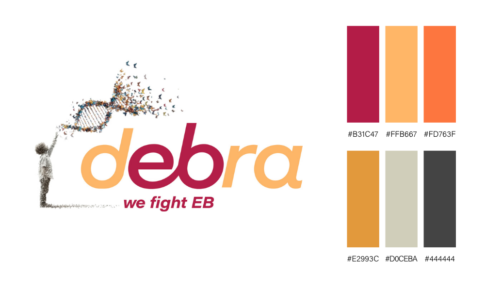
This refresh was designed by John Rea, an award-winning creative director with over 30 years of experience in advertising, branding, and healthcare communications. John is also a longtime supporter of debra of America, and his understanding of both our mission and the EB Community made him the perfect partner to lead this effort.
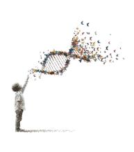
The Child Icon: A Symbol for the Entire EB Community
At the center of our new identity is a child gazing upward at a DNA strand made of butterflies.
The child represents hope, resilience, and new beginnings. While it depicts youth, its meaning is universal; it stands for every person living with EB, at every age and every stage of life. The upward gaze speaks to optimism and the future we're building together.
The DNA strand reflects the genetic reality of EB, while the butterflies - long a symbol of the EB Community - transform that science into something hopeful. Together, they represent the breakthroughs happening at the molecular level: three FDA-approved treatments, two of them gene therapies, and more on the horizon.
EB does not end at childhood, and neither does our commitment. This icon reflects new treatments, new possibilities, and a renewed promise that progress belongs to the entire EB Community.
Same Mission, Bolder Vision
Our mission hasn’t changed. We remain fully committed to improving the quality of life for all people living with EB through patient support, education, advocacy, and research funding.
We are so proud of where we’ve been, and we are even more excited about where we’re going. With FDA-approved treatments, a more connected community, and a renewed sense of purpose, the future of EB care, advocacy, and research is brighter than it has ever been.
Over the next couple of weeks, you’ll start seeing these updates rolled out across our website, social media channels, emails, and printed materials.
Thank you for being part of our journey.